Coates Hire
Every piece of equipment on a job site is a piece of media. Coates Hire owned thousands of them and wasn't using one.
A category leader sitting on a -7.3% decline, it had quietly dropped "Hire" from its own name years earlier, and never claimed the one asset already inside its brand: the highest-visibility orange on a work site.
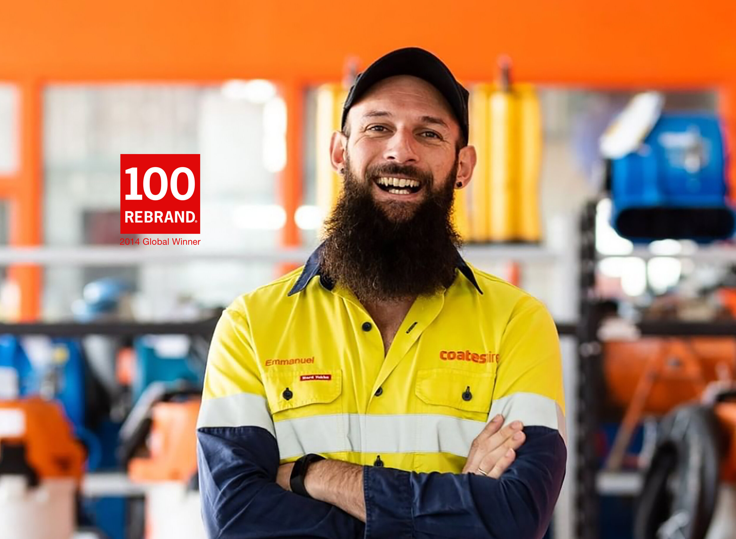
The rebuild worked from the inside out rather than mass media in. We reclaimed "Hire" in a wordmark built to read from a moving vehicle, and gave Coates ownership of an exact orange — RAL and Pantone 172 — commissioned as a custom Dulux mix so every shed, office and piece of equipment matched precisely. The guidelines that held that discipline in place were bound in waterproof Tyvek, built to survive a work site, not a boardroom.


Before & After
Increasing perceived value, recognition and recall by design
A 20.2% sales increase within two years. Top-of-mind awareness up 31%. Brand preference up 52%. Market share up 23%.
Recognised by the AMA Australian Marketing Institute as that year's Brand Revitalisation and Brand Effectiveness winner.
Global ReBrand Award winner