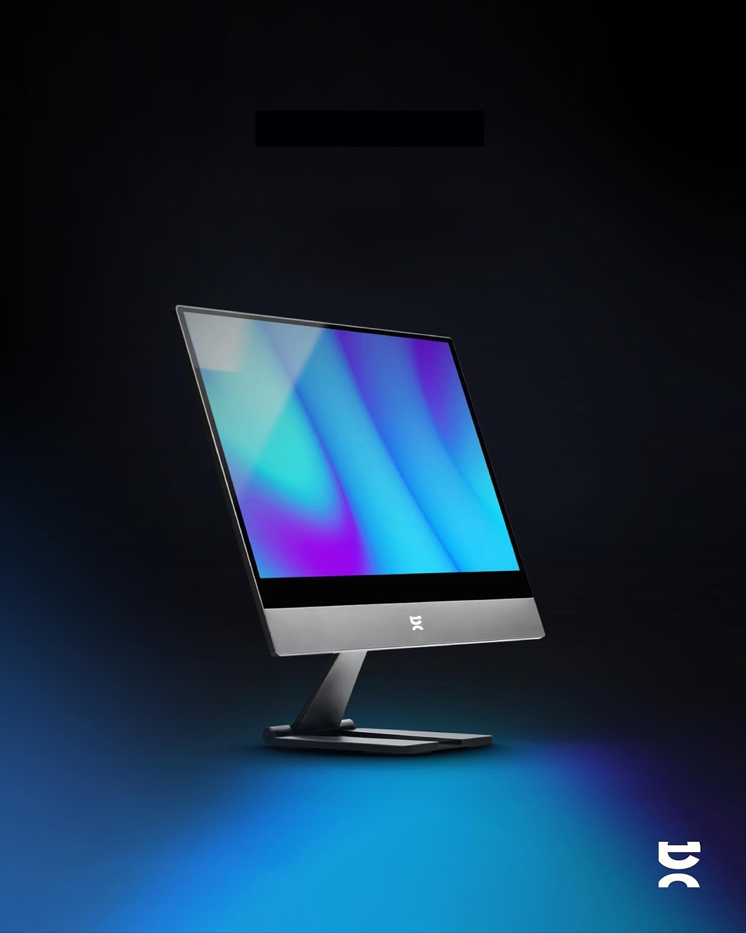
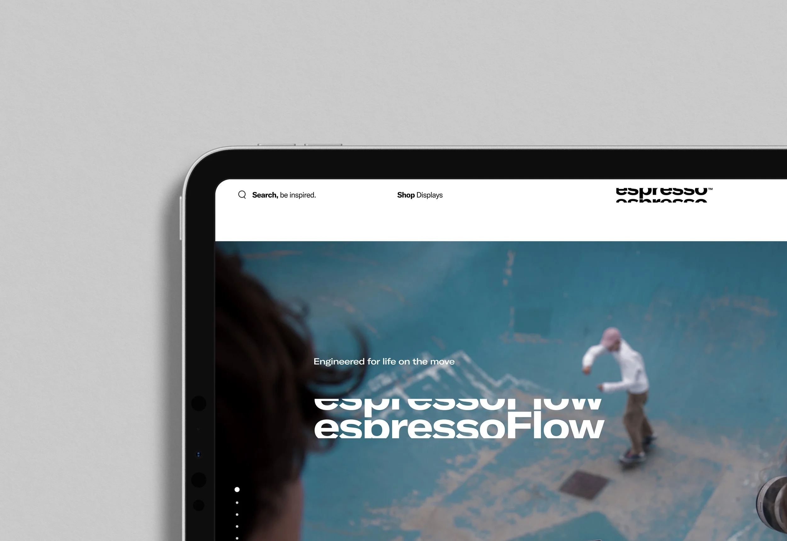
espresso Displays
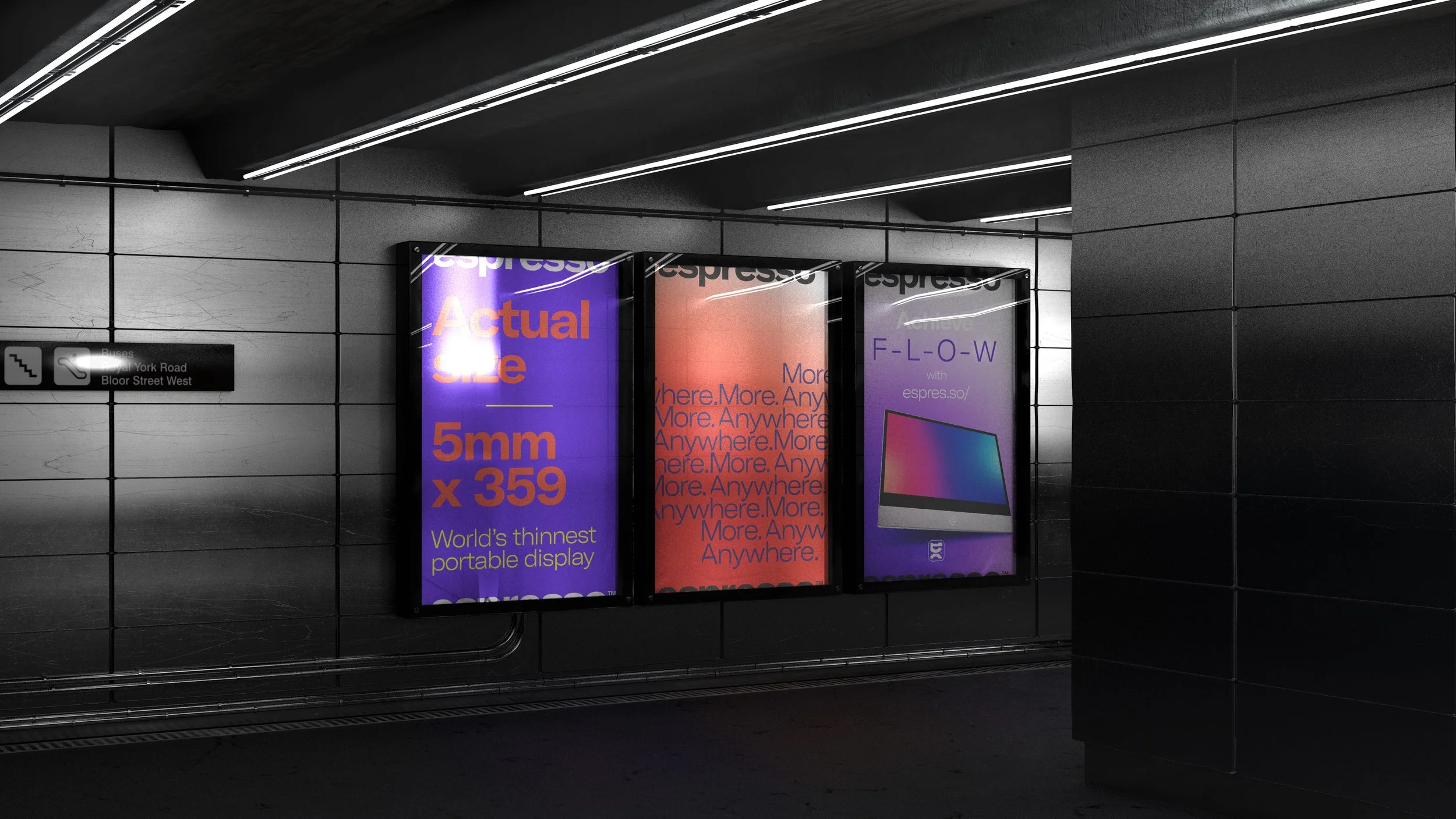
More. Anywhere.
Brand strategy · Investor narrative · Identity · Packaging · Go-to-market
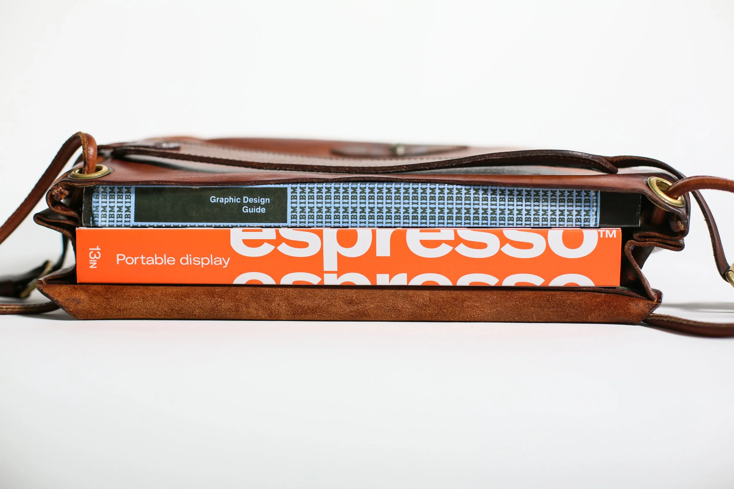
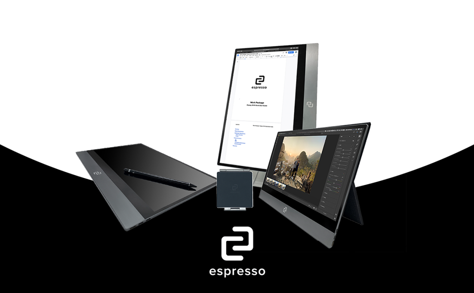
Four engineering graduates at UTS built a portable monitor in their final year — not as a business idea, but to solve their own problem. They kept running out of screen space working collaboratively in cafes. People started asking where they could get one. That was the business.
The commercial truth was already in the product: more space for whatever you need to do, wherever you are. COVID didn't change that argument. It proved it.
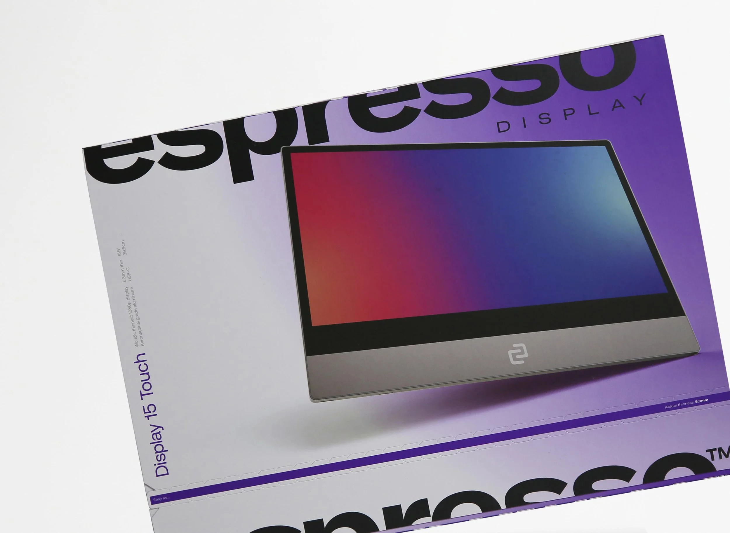
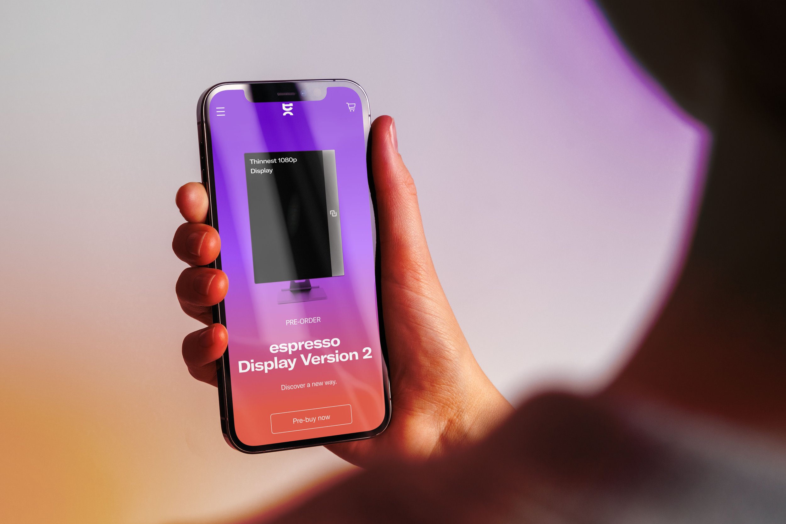
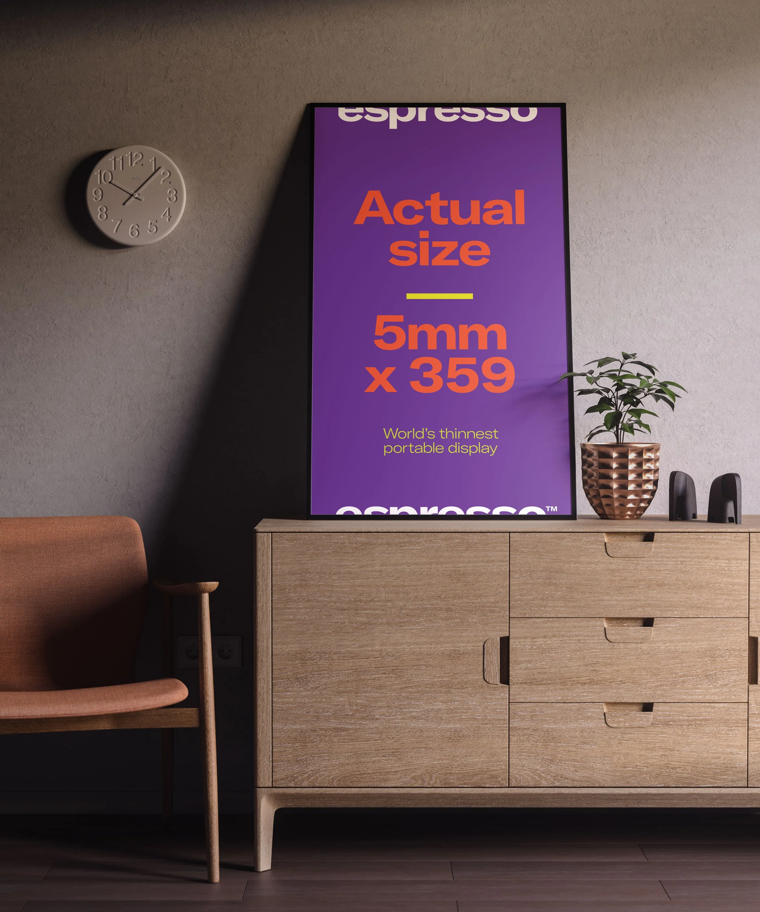
The name risked confusion with coffee. The argument for keeping it held: like espresso, small, powerful, portable. The logo was designed to frame whatever the customer displayed — dynamic by nature, personal by use.
Espresso Displays grew 38× in three years. Revenue reached $1 million per month.


Before & After
Increasing perceived value, recognition and recall by design